瀑布流又称瀑布流式布局,是比较流行的一种网站页面布局方式,视觉表现为参差不齐的多栏布局,随着页面滚动条向下滚动,这种布局还会不断加载数据块并附加至当前尾部。
最早采用此布局的网站是Pinterest,逐渐在国内流行开来。
花瓣、小红书等需要图文混排,且图片尺寸不一的网站,布局都是使用的瀑布流。

瀑布流的优势:
- 不裁剪不拉伸的以原比例完整的展示图片,不同尺寸排布错落有致
- 空间使用更加充分,视觉上也让注意力集中在图片上,便于快速获得更多信息
- 布局简洁清新,避免页面复杂乱糟糟
以下介绍瀑布流在前端的三种实现方案
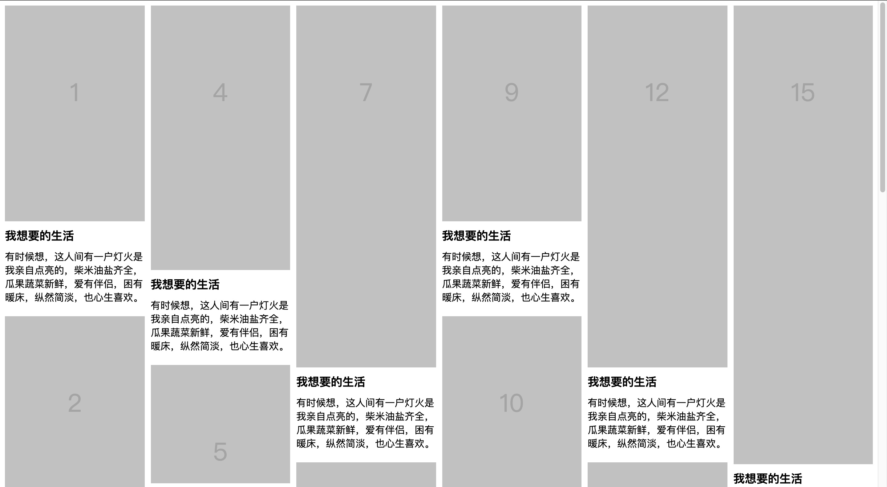
1. 纯 HTML + CSS column 实现
column可以指定容器下元素列的宽度和数量
1
| columns: column-width column-count;
|
瀑布流用到的属性是:
column-count:指定列数
column-gap:列之间的差距
演示:
html:
1
2
3
4
5
6
7
8
| <div class="list">
<div class="item">
<img src="https://s4.ax1x.com/2022/02/17/H4YZeH.png" />
<h3>标题</h3>
<p>描述</p>
</div>
...
</div>
|
css:
1
2
3
4
5
6
7
8
9
10
11
12
13
14
| .list {
columns: 4;
column-gap: 20px;
}
.item {
width: auto;
break-inside: avoid;
margin-bottom: 20px;
}
.item img {
width: 100%;
}
|
此方案布局排布顺序见图,从上至下,从左至右,布局顺序不太理想。但是不需要js,纯 HTML + CSS 实现的。
在线demo
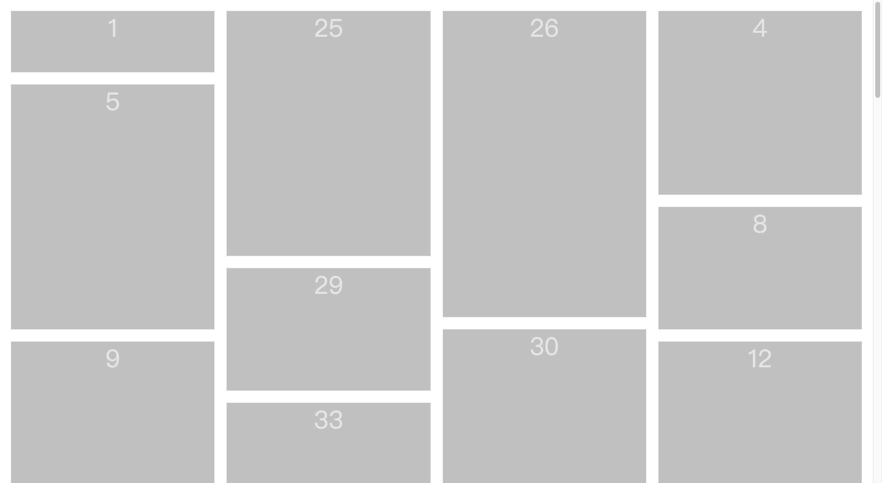
2. 纯 HTML + CSS flex 实现
对父容器设置弹性盒后,因为瀑布流是多行的所以还要flex-wrap设置wrap,并且flex-direction还要设置为column。
最关键的是一定要设置一个高度。
演示:
html:
1
2
3
4
5
6
| <div class="list">
<div class="img" style="height:100px">1</div>
<div class="img" style="height:250px">2</div>
<div class="img" style="height:120px">3</div>
...
</div>
|
css:
1
2
3
4
5
6
7
8
9
10
11
12
13
14
15
16
17
18
19
20
21
22
23
24
25
26
27
28
29
30
31
32
33
| .list {
display: flex;
flex-wrap: wrap;
flex-direction: column;
height: 3800px;
}
.list>.img {
position: relative;
width: calc(100% / 4 - 20px);
margin: 10px;
box-sizing: border-box;
background: rgb(193, 193, 193);
font-size: 40px;
text-align: center;
color: rgb(229, 229, 229);
}
.list>.img:nth-child(4n+1) {
order: 1;
}
.list>.img:nth-child(4n+2) {
order: 2;
}
.list>.img:nth-child(4n+3) {
order: 3;
}
.list>.img:nth-child(4n) {
order: 4;
}
|
在线demo
3. js + position 实现
js实现瀑布流的话,考虑把子元素全部设置成绝对定位。
然后监听图片加载,如果加载完就把子元素设置其对应的位置,逐个塞到父容器中。
父容器高度取列表数组的最大值,子元素设置 absolute 通过上一层排列位置及高度,来摆放下一个的 top/left 定位位置
演示:

html:
1
2
3
4
| <div class="list">
<div class="img">1</div>
...
</div>
|
css:
1
2
3
4
5
| .list .img {
position: absolute;
width: 250px;
margin: 10px;
}
|
js:
1
2
3
4
5
6
7
8
9
10
11
12
13
14
15
16
17
18
19
20
21
22
23
24
25
26
27
28
29
30
31
32
33
34
35
36
37
38
39
40
41
42
| var colCount // 定义列数
var colHeightArry = [] // 定义列高度数组
var imgWidth = $('.list .img').outerWidth(true) // 单张图片的宽度
colCount = parseInt($('.list').width() / imgWidth) // 计算出列数
for (var i = 0; i < colCount; i++) {
colHeightArry[i] = 0
}
// 当窗口大小重置之后,重新执行
$(window).on('resize', function () {
reset()
})
// 当窗口加载完毕,执行瀑布流
$(window).on('load', function () {
reset()
})
// 定义reset函数
function reset() {
var colHeightArry = []
colCount = parseInt($('.list').width() / imgWidth)
for (var i = 0; i < colCount; i++) {
colHeightArry[i] = 0
}
$('.list .img').each(function () {
var minValue = colHeightArry[0]
var minIndex = 0
for (var i = 0; i < colCount; i++) {
if (colHeightArry[i] < minValue) {
minValue = colHeightArry[i]
minIndex = i
}
}
$(this).css({
height: Math.floor(Math.random() * (600 - 100 + 1)) + 100,
left: minIndex * imgWidth,
top: minValue
})
colHeightArry[minIndex] += $(this).outerHeight(true)
})
}
|
在线demo
总结
以上就是瀑布流布局的三种主流方案。
只使用 css 实现相对简单,性能好,图片自动填充不用考虑图片加载状态。
column 的效果无法修改排布顺序,flex 实现的顺序在一定程度上可以改变。
使用 js 实现,优点是控制灵活,随意扩展,也可以无限加载,不用过多考虑兼容问题,同时可以添加诸多动画来增强用户体验。
但是实现相对复杂。图片填充需要考虑图片加载状态,性能逊色于纯css实现。

